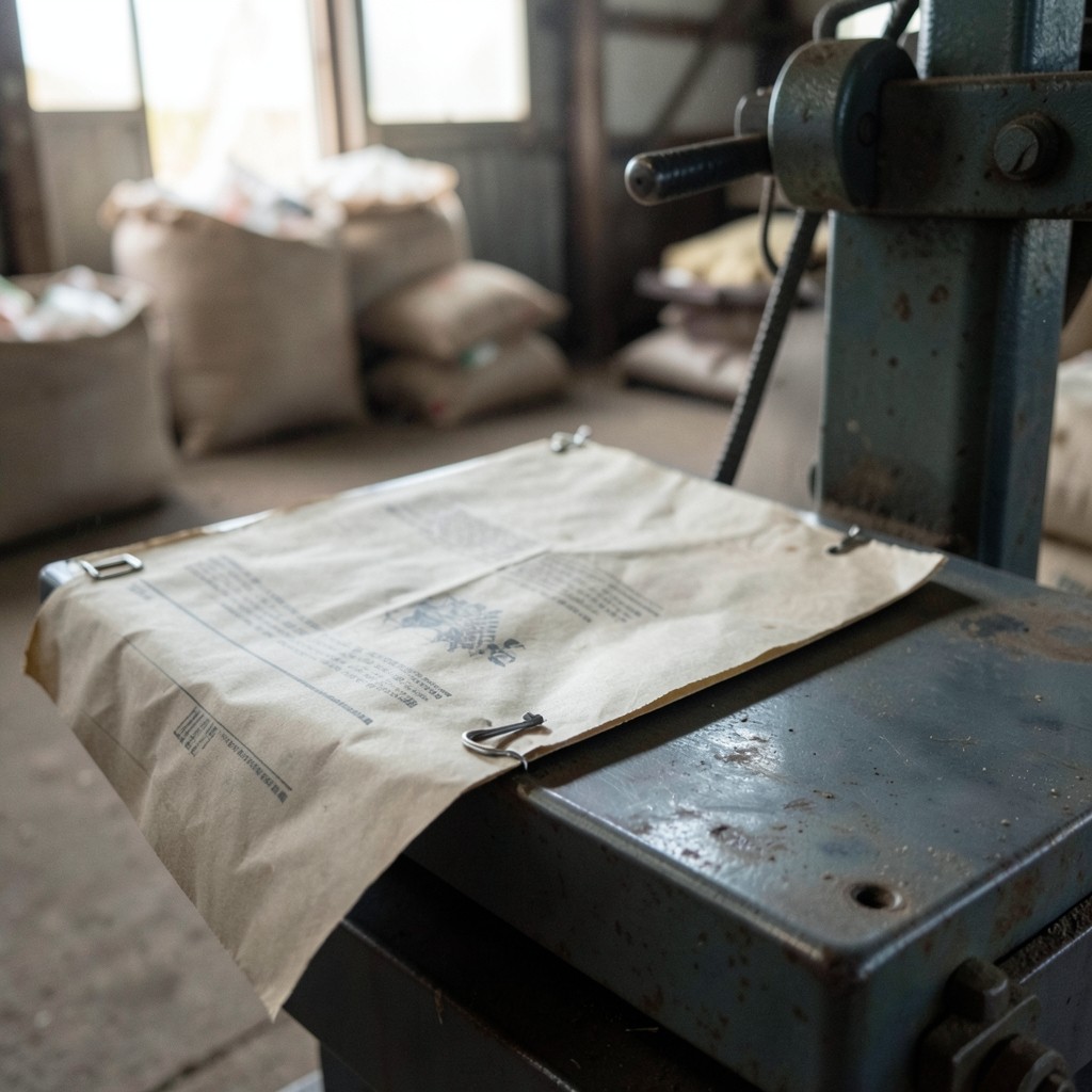
Most seasonal yield reports start the same way: a stack of weight sheets from the scale house, sometimes stamped, sometimes annotated in pencil. Before any chart is useful, those columns need a shared reading.
Begin with plot identity. If a sheet says “north terrace” on Monday and “N-3” on Thursday, reconcile the names against your map before summing. Mixed labels are the most common reason hectare averages jump between drafts.
Next, separate gross weight from graded weight when both appear. Rice and fruit buyers often care about first-grade share as much as total tonnage. Collapsing those columns early hides the story cooperatives later need in meetings.
Date stamps matter for year-over-year panels. A late truck arriving after the official cut-off still belongs to the season, but it should be footnoted so nobody treats it as a different harvest window.
When Glow Atlashub prepares agriculture yield reporting packs, we ask for one prior season of comparable sheets if you want comparison charts. Gaps are marked openly rather than filled with neighbor averages.
If your sheets are handwritten, photograph them in even light. Shadows across the kilograms column slow reconciliation more than any other scanning issue we see.